Text format. No visual preview.
Blueprint (WHO · WHY · WHAT · HOW)
web- Generator
- apps/portal/components/hifi-templates/master/slot-map.ts · /blueprint/[slug]
- Locked
- slot-map.ts:2 — “CANONICAL BLUEPRINT SLOT MAP — LOCKED (mk, 2026-08-14)”
0hr.app · the operating system for freedom
Every token, primitive, and section pattern that makes up the 0HR product surface — on one page. Retro-CRT meets gradient-first. Refine here, reuse everywhere.
The tokens every surface is built from.
Two accents carry the brand — Royal Blue and Electric Pink — almost always together as a gradient. Gold and green are reserved for vision/terminal moments. The canvas is pure black with white/neutral text.
The blue→pink gradient is the single most recognizable element of the system. It appears as button fills, active-state pills, text fills, and glow shadows.
Geist / Inter for UI. The headline voice is unmistakable: font-black, italic, UPPERCASE, tracking-tighter. Mono (Geist Mono / DM Mono) for labels, terminals, and stat values.
Get a custom roadmap to escape the rat race. $0 · Personalized · Takes 60 seconds.
TWO BRANDS, ONE SYSTEM (mk 2026-08-29). Different Hunger is the movement; 0 Hour is the operating system it ships. Both marks live here because surfaces pair them — /studio runs the 0HR wordmark with "Powered by" + the DH mark beneath it.
Different Hunger · the movement


/brand/dh-logo-dark.png → WHITE ink, for DARK backgrounds
/brand/dh-logo-light.png → BLACK ink, for LIGHT backgrounds
⚠ the suffix names the BACKGROUND, not the ink. Reaching for "light" on a dark surface renders it invisible.
0 Hour · the operating system

/brand/0hr-studio-wordmark.png → WHITE, for DARK backgrounds
⚠ /brand/0hr-studio-logo.png has NO alpha — a dark plate is baked in, so it shows as a black box on any light surface. Do not use it on white.
The mark · RetroLogo, at size
The lockup · as it ships on /studio
Powered byInstalled, in production, reused everywhere.
CANONICAL: the ActionButton — blue→pink face, bloom that blends. Below it, the older variants kept for reference: GradientButton, ShimmerButton (Aceternity), and the solid/outline secondaries.
The LIFE / BRAND mode toggle — active segment fills with the gradient pill.
Trust pills and status badges for social proof and state.
The rails we accept, as real brand SVGs — the marks a buyer recognises, not outlined stand-ins. Sourced from Simple Icons (already a dependency, tree-shaken and inlined, so the row costs no network request); USDC is drawn by hand because no installed set ships it. Rendered by /invest, /invest/operating and /order.
Badge — the default. One plate per mark, so a wide wordmark and a round symbol carry the same optical weight instead of fighting each other.
Bare — marks on the page ground, for a quiet strip under a heading.
Rows — the ORDER FORM's rail anatomy: name, its marks, settlement chip. Card wallets ride the card rail rather than becoming a fourth group, exactly as checkout treats them.
Filtered — only={["crypto"]}. Every rail is tagged card · wallet · crypto · bank, so a surface shows only what it can take.
Our 3D Guarantee
Money Back
Return on Investment
Time Freedom
Money Back
Return on Investment
Time Freedom
Money Back Guarantee
ROI Guarantee
Time Freedom Guarantee
Money Back Guarantee
ROI Guarantee
Time Freedom Guarantee
Money Back Guarantee
ROI Guarantee
Time Freedom Guarantee
Money Back Guarantee
ROI Guarantee
Time Freedom Guarantee
Money Back Guarantee
ROI Guarantee
Time Freedom Guarantee
The two-column metric grid from the landing — pink-bordered on the left, blue-bordered on the right, over a blurred black panel.
LOCKED. Every card leads with its number, then a Title Case line with one gradient highlight, then a chart — never a bare stat. Story order: speed → volume → value. Types: hours track (Launch → Lead #1), growth line, breakdown bars, week grid. Data comes from the generator (tools/case-study-gen), verbatim-checked.
Days to First Lead
Sales Calls Booked
Closed in 93 Days
New Leads in 1 Month
Weeks to First Deal
30 Day Client Value
The /results hero outcomes: More Time · More Profit · More Revenue (+2 new clients, with client LTV). A = the /studio Reported Averages stat, tightened. B = the 08b stat card. Numbers are the published /studio averages.
Variant A
Free Time
Grew Profit
New Clients
Client LTV
Variant B
More Time · Free Time
More Profit · Grew Profit
More Revenue · New Clients
The canonical tooltip for 0hr.app — Aceternity’s tooltip-card, installed verbatim. The card follows the pointer and springs open to its content height. Content takes a string or a node. Hover any swatch below.
Hover a link, see the thing. Aceternity’s link-preview, adapted 2026-08-04 to render a REAL screenshot out of /public — never a third-party screenshot service at render time. The preview tracks the pointer’s x-position and tilts with it.
Every live example on the prototype order form is one of these — hover the showcase or the prototype offer to see it.
ONE affordance for every item that expands into a modal. The badge is lucide Maximize2 in a ring-1 chip pinned top-right; the card is the hover group, so the badge brightens when the card does. There is no second “view” glyph — view is the same badge plus aria-label="View <name>" and the tooltip card. Never hand-roll a different expand icon.
The traffic light, LOCKED 2026-05-22. Three states, one meaning, everywhere — command center, deliverables, integrations, sprints, the comparison table. Context varies, meaning never does. Pink is ACTION and is never a status; these three are status and are never an action.
on AND/OR healthy
#10b981at risk AND/OR in motion
#f59e0bblocked AND/OR critical issue
#ef4444The whole command center in one line, LOCKED 2026-09-02. Four dimensions, each carrying the canonical traffic light: DISTRO (eye), LEADGEN (globe), ACQUISITION ($),RETENTION (heart) on a brand — MIND, BODY, INCOME, LOVE on a human. One component renders either, and the portfolio is the same line repeated.
The light is the TREND, not the level. Flat is red — profit is the foundation, growth is the transformation. Not measured is also red: running blind is blocked, and the traffic light has three states, never four. Every red carries an owner and a due date; the type makes a red without one impossible to construct. Hover a glyph for metric → system → input → action → update. Icons are the locked dimension glyphs from Glyph/icons.
The real table, rendered from the real data — feature rows down the left, the featured column first, alternatives after, one status dot per cell and the legend underneath. Cell copy is verbatim; the dot restates the verdict in the same three colours the command center uses. A cell with no verdict shows no dot. One dataset drives it — app/compare/_data.ts — and /compare, /studio and every offer page render this same component, personalized per tier.
Fire Yourself from Daily Operation in 57 Days, Guaranteed.
Chief Technology Officer · [PLACEHOLDER] — no per-role monthly is published on its own
0 Hours
$999+
Instant
Yes
Yes
Many Hours
$10,000 - $40,000
The avg. agency retainer is $5K to $20K monthly & most companies work with at least 2 agencies. (Source)
Weeks
No
Rarely
The gate every offer-page CTA opens. Five steps, locked (mk 2026-09-15): NEEDS → REVENUE → LTV → BUDGET → EMAIL, then it auto-qualifies and routes. NEEDS is a multi-select; revenue, LTV and budget are preset range chips whose edges sit EXACTLY on the blueprint qualifier numbers and nowhere else — $3K/mo, $25K/mo ($300K/yr), $5K and $9K LTV, $45K budget — extended upward to $10M+/mo, $10M+ LTV and $1M+ budget. Anything the /start/brand diagnostic already answered arrives pre-selected and badged; under $3K/mo routes to the free Client Acquisition Challenge instead of an offer. Mobile-first: bottom sheet on phones, centered modal from sm up.
The eyebrow that sits above the hero CTA on /invest, /offer and /order. Three concepts, all on real numbers from /api/prototype/trust — 0 current hero (service businesses + faces), 1 founder count, 2a "Attract Better Clients" with the deal logos sliding through the pill. On 2a the logos that all answer: hover or tap one and its proof floats in a tooltip pinned ABOVE that logo — so the brow stays one line and drops into a hero untouched. Where a case study exists the headline, stats and client are verbatim from the case-study master; the rest carry an explicit [PLACEHOLDER] until the copy and image are locked — never an invented reason. The tooltip is portaled and fixed-positioned because the pill clips everything rendered inside it (rounded + overflow-hidden + the marquee mask).
Everything that moves, and the rules it moves by.
AuroraText (rotating gradient fill) and AnimatedShinyText (sweeping shine).
Count-up stats that animate into view.
A traveling gradient beam around a card edge — for featured / active panels.
A custom roadmap generated in under a minute. $0, personalized, no strings.
Infinite-scroll social proof — the "Latest Wins Shared" ticker.
Approved content formats for this brand. Reuse these generators as-is. Each preview is real generator output.
The isometric proof wall. One component, two presets — the difference is the GEOMETRY, not a scale: the grid is rotated −45° from its top-left origin, so it crosses the frame as a diagonal ribbon. A landscape frame needs a square grid; a 9:16 frame needs a wider ribbon re-anchored, or two opposite corners fall outside it. Feeding it more tiles is what fills those corners without zooming in and softening the artwork.
System variant
Web · 4 col · square grid
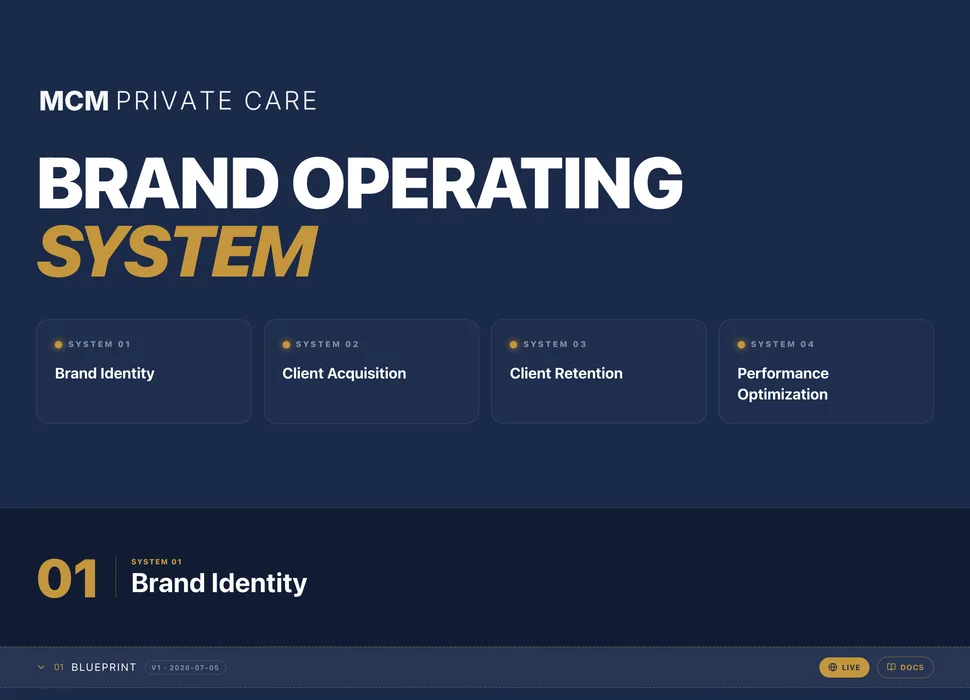
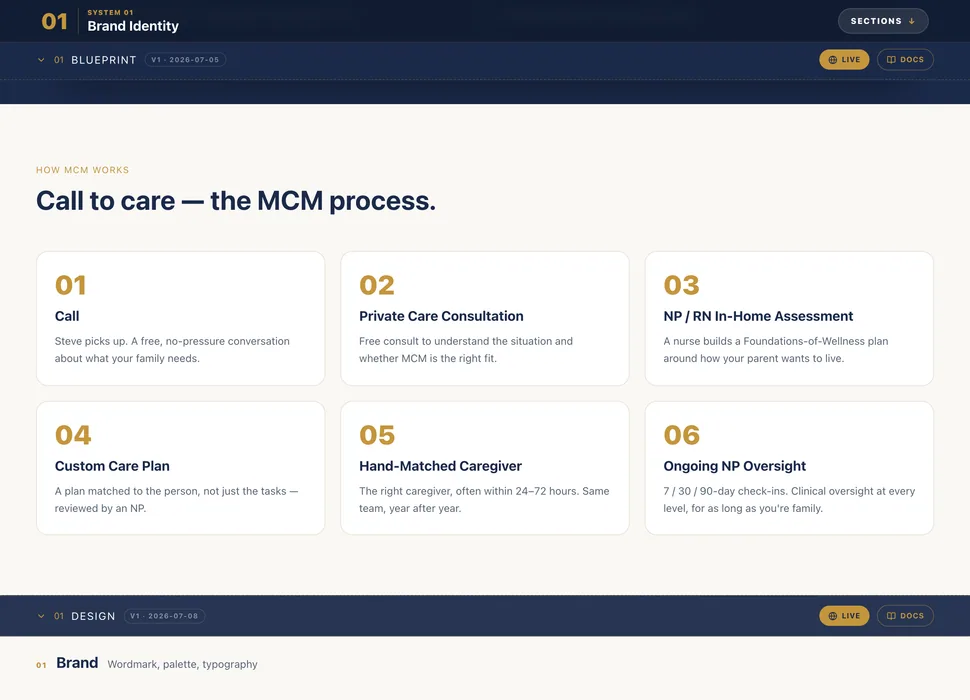
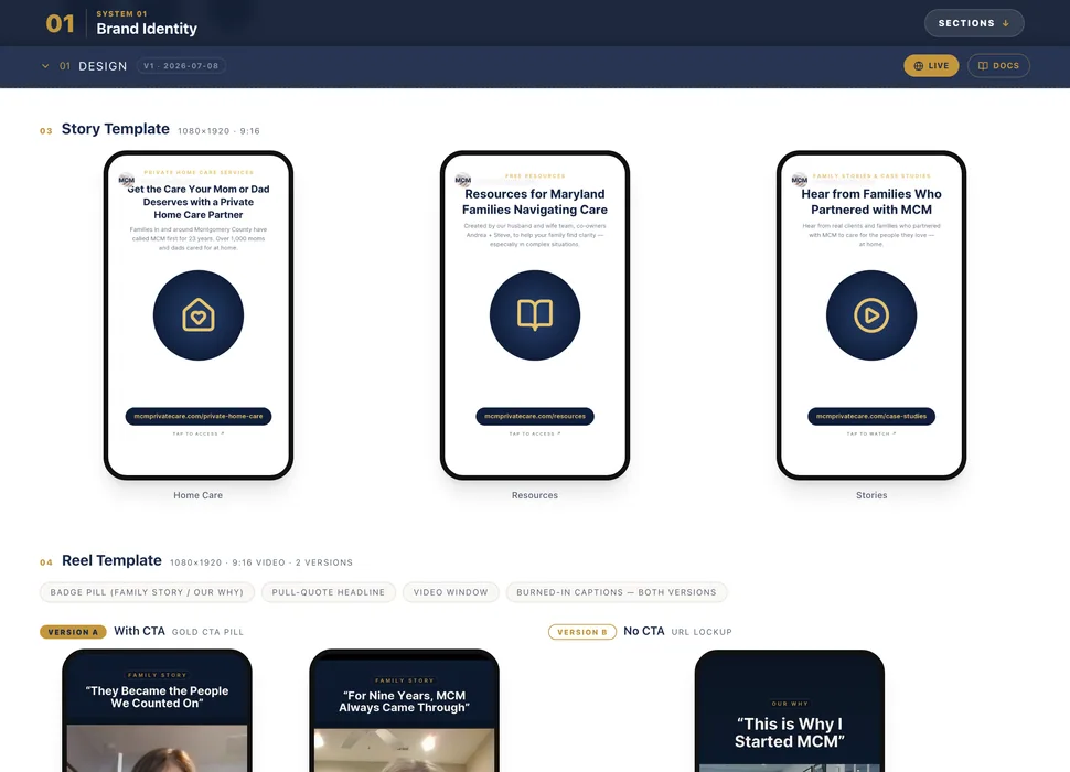
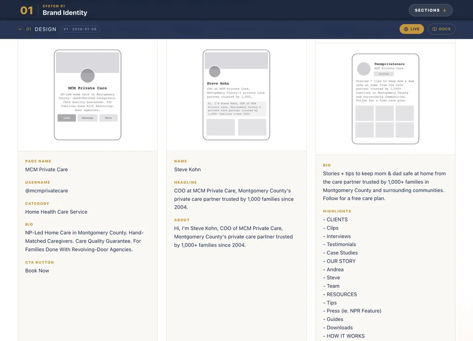
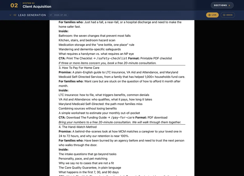
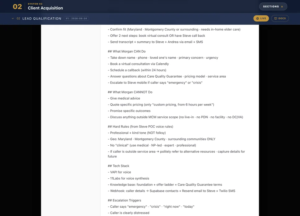
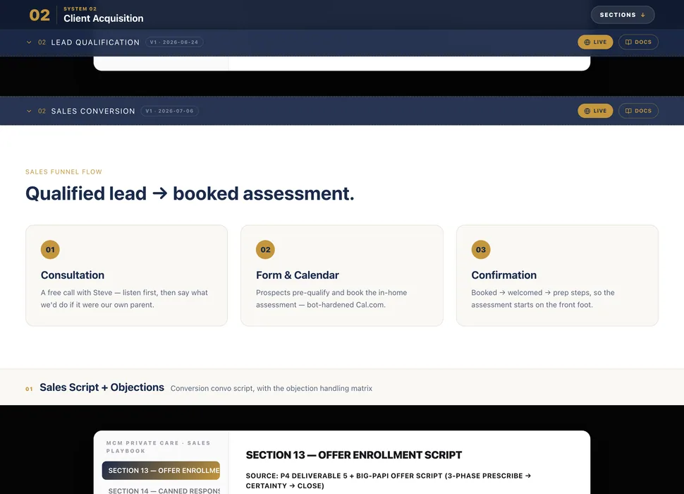
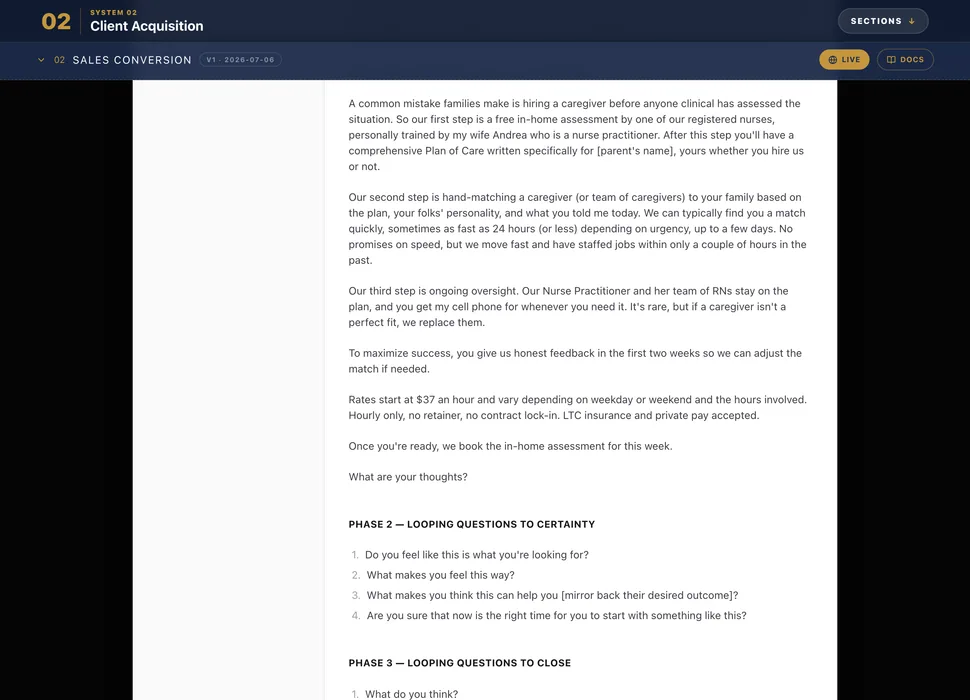
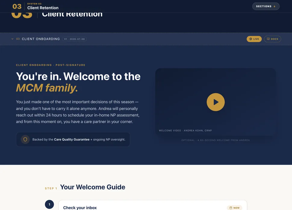
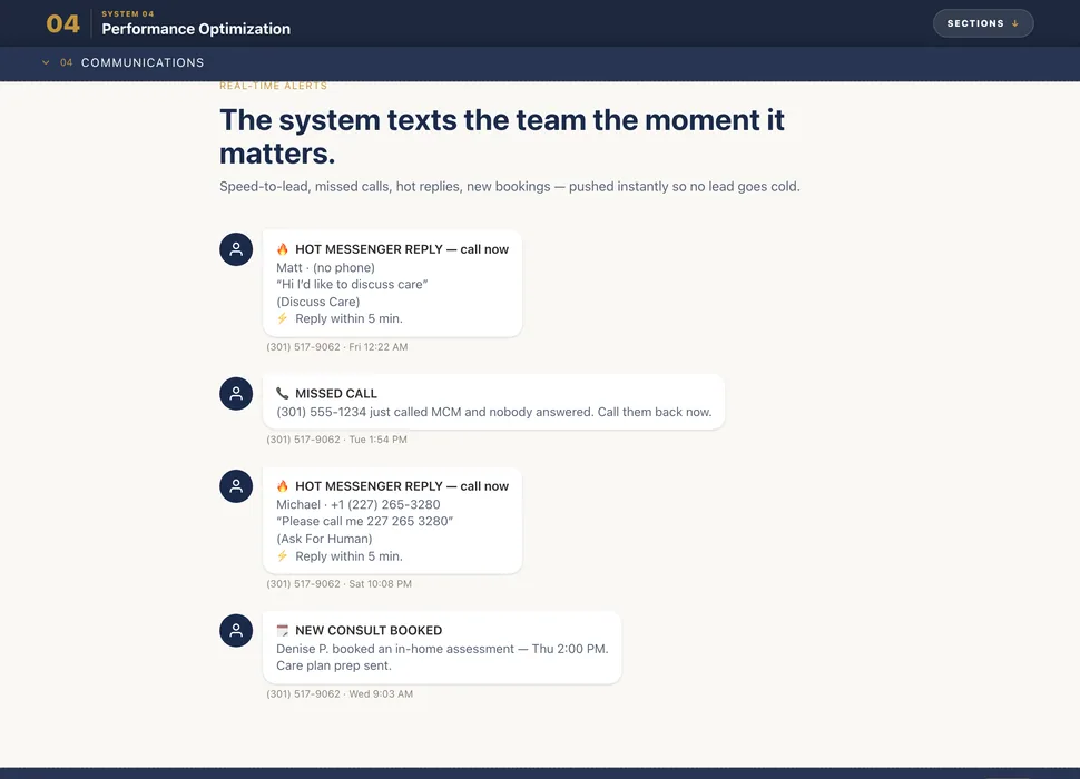
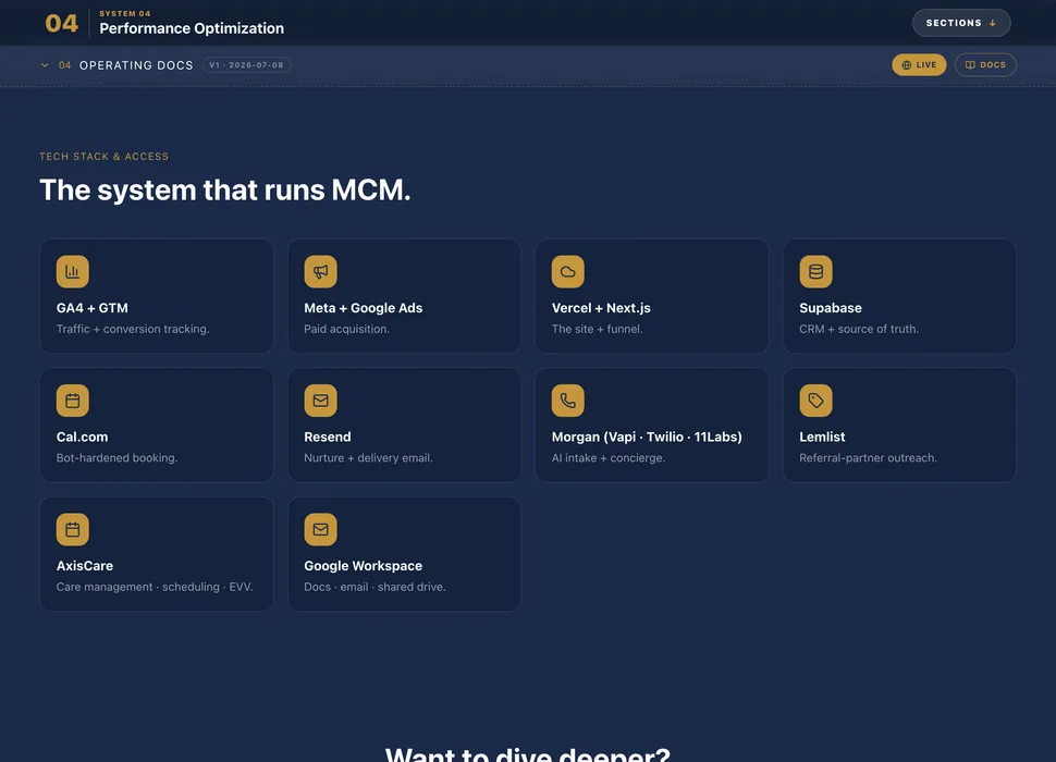
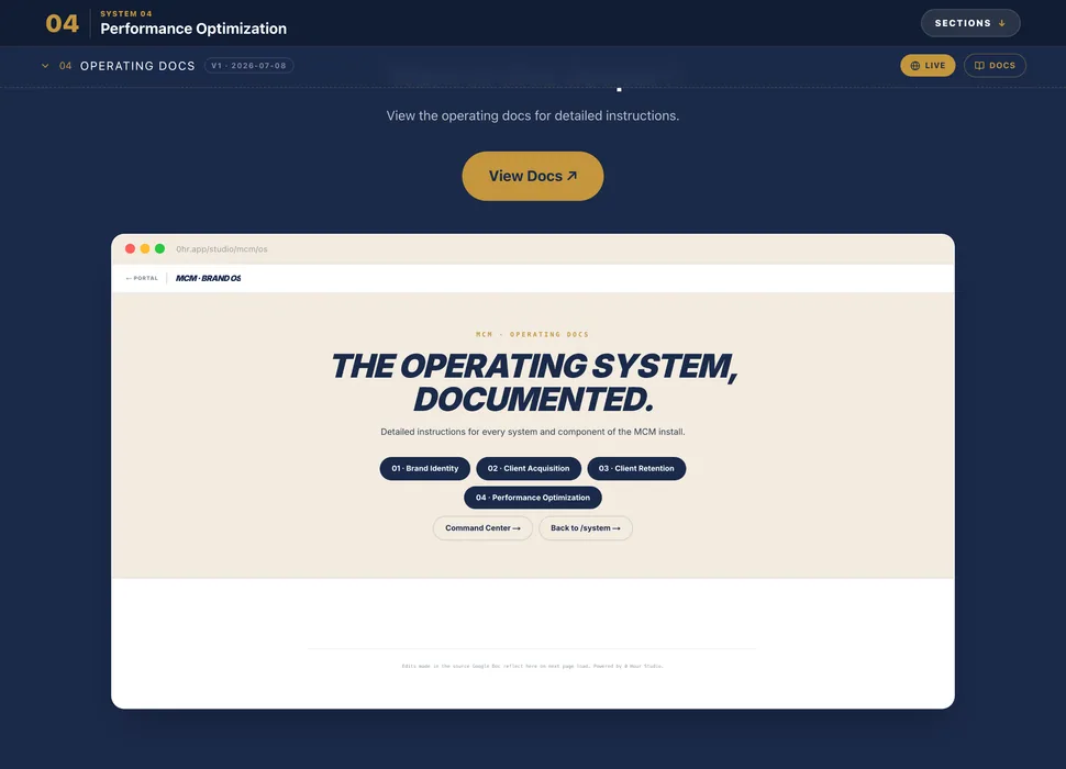
<ThreeDMarquee images={tiles} />
Mobile · 9:16 · reel preset
columns={5} minTiles={140}
frameClassName="size-[3400px]"
offsetClassName="top-[26%] right-[64%]"
scaleClassName="scale-[0.94]"
preview at 0.24 for this 280px frame
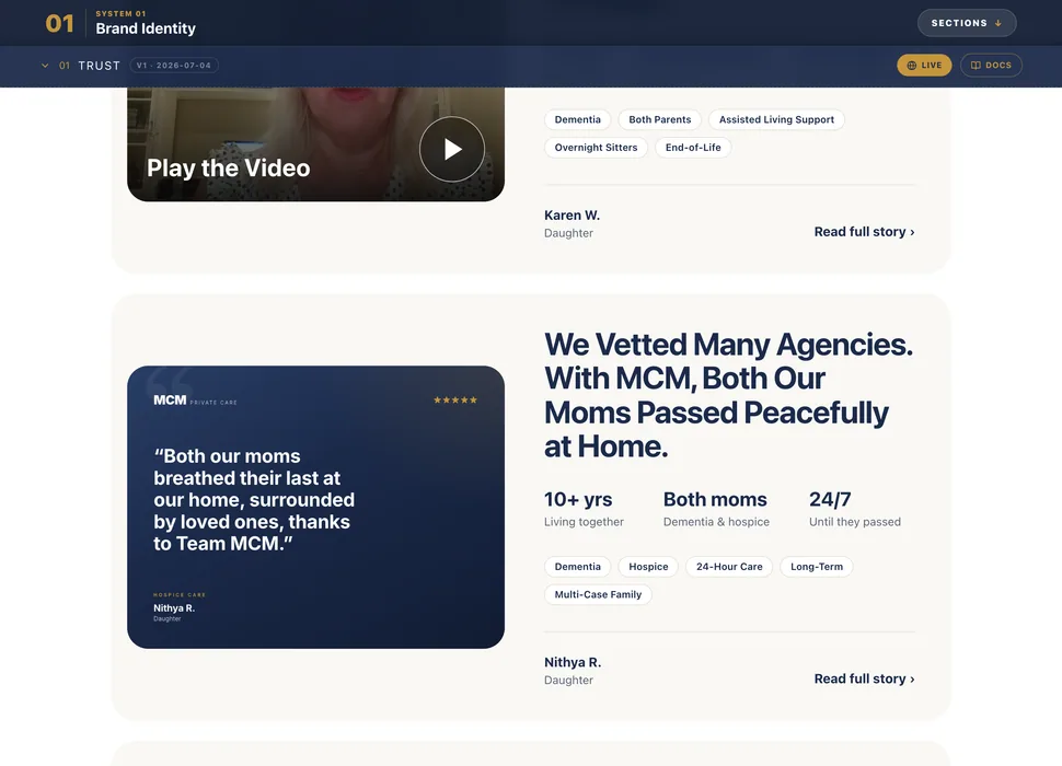
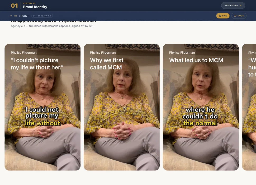
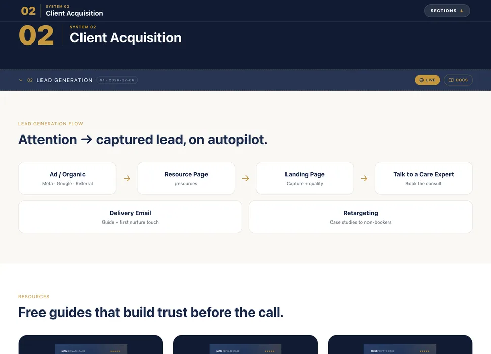
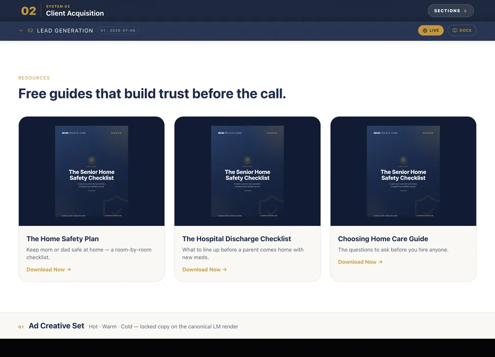
MCM's installed operating system — one tile per section of /system.
Case Study variant
Web · 4 col · square grid
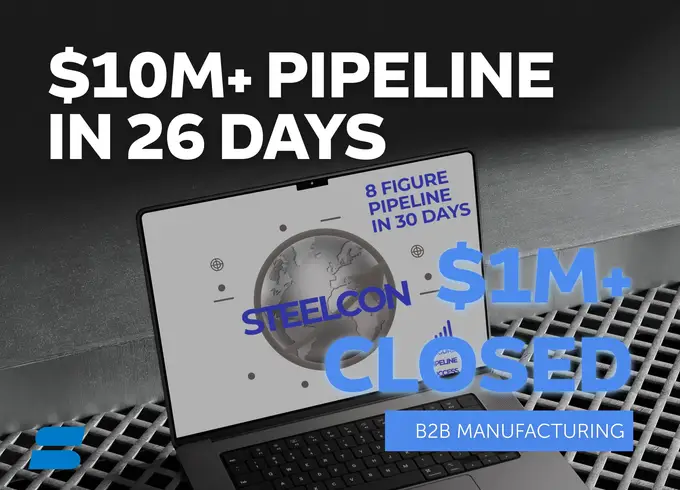
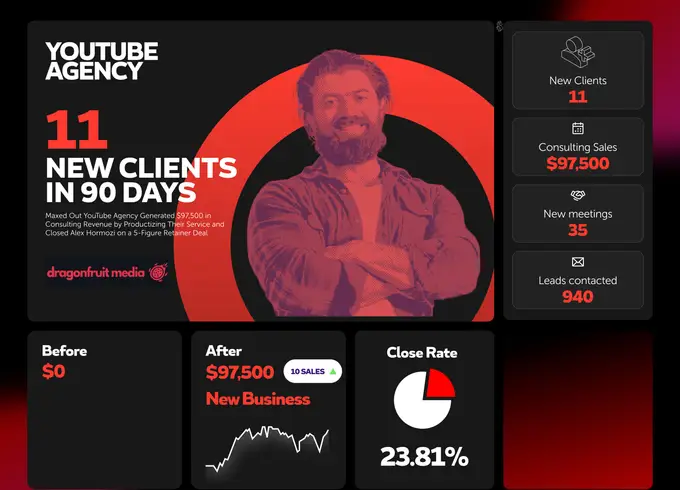
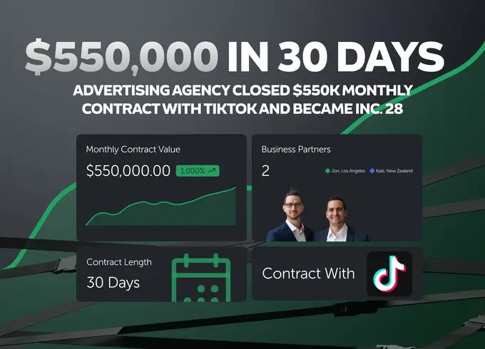
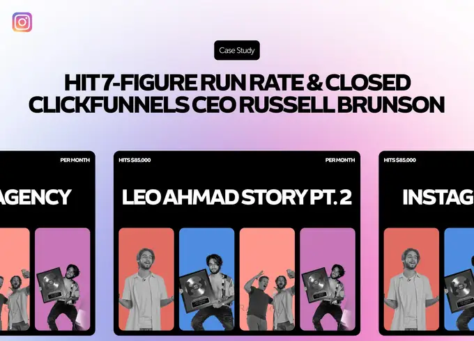
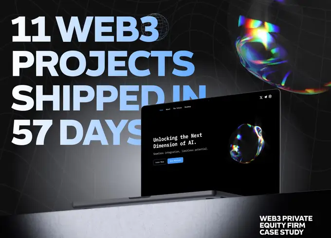
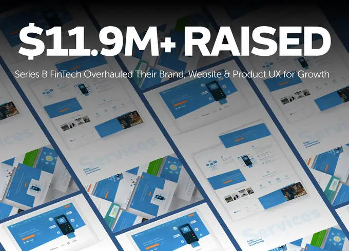
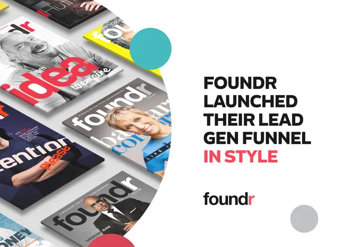
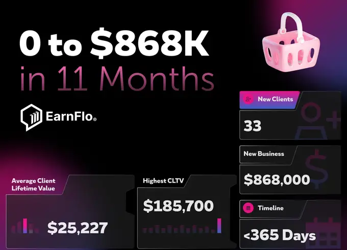
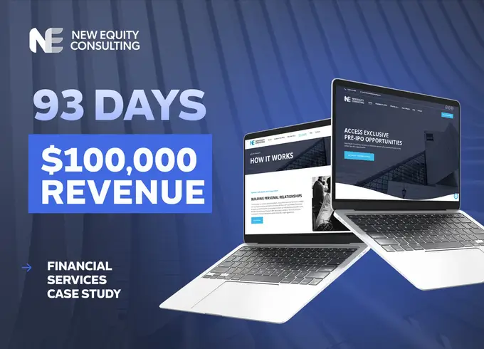
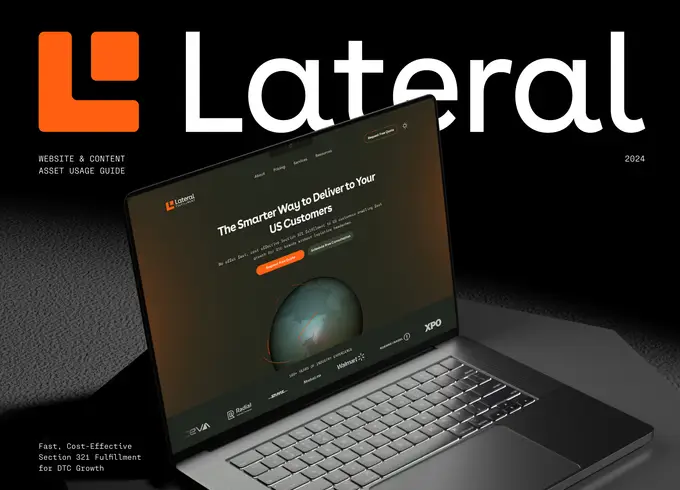

<ThreeDMarquee images={tiles} />
Mobile · 9:16 · reel preset
columns={5} minTiles={140}
frameClassName="size-[3400px]"
offsetClassName="top-[26%] right-[64%]"
scaleClassName="scale-[0.94]"
preview at 0.24 for this 280px frame
The designed case-study covers. Filtered on filename (*-cover*, never *-hero), so plain client photography can never land on the wall.
TILES MUST SHARE ONE ASPECT. The component renders every image at 970/700 with object-cover, so a set whose sources range 1.6–2.8 crops unevenly and the wall reads as ragged. Capture at the component's aspect rather than fixing it in CSS — see scripts/capture-mcm-system-tiles.mjs, which sizes the viewport to the tile.
The matrix surface: dual-color grid (blue + pink offset), central blur glow, radial vignette, and a repeating scanline texture.
Corner glow: the deck ground, coded. Four radial gradients over pure black — pink and royal blue at the top, blue and magenta at the bottom — replacing the exported BACKGROUND 2.svg. No image and no filter: blur(); the five-stop alpha ramp on each corner is what reproduces the 200px gaussian in the source SVG, and a faint noise layer kills banding on the large dark field. Takes corners(all / top / bottom), intensity and grain.
The Rebel CRT terminal aesthetic — pink glow border, mono text, blinking cursor.
specs/assets/*.anim.htmlHow a canonical diagram is put on screen. The artwork builds one element at a time in reading order, holds, then deconstructs in exact reverse — a seamless loop with no cut. Blanc Bold for titles and headings, Blanc Ultralight for body, DIFFERENT HUNGER last. One rule, every diagram.
Title → subhead → grid → each quadrant label, then its question → wordmark
Title → subhead → guides → each pillar, its rituals rim-inward, then its arc → INNER PEACE → wordmark
Title → subhead → spokes → ring → each quadrant, its stages rim-inward, then its arrow → PROFIT → wordmark
The page frame every non-conversion surface inherits.
The full landing hero — masthead, gradient headline, dual CTA, and live proof.
$0 · Personalized · Takes 60 Seconds
LOCKED 2026-09-29, updated 2026-10-07: SHOWCASE · RESULTS · SYSTEM · PRICING + GET ROADMAP (closing CTA: INSTALL NOW). Two Aceternity Pro blocks combined: the simple-navbar pill slides behind the hovered link, and the navbar-with-children panel morphs between menus — reworked as a link preview: child links on the left, a preview on the right that swaps to the child you point at and tilts with the pointer. Every label, metric and sub is read from its source (showcase-projects.ts · case-studies.json · invest/tracks.ts). The scroll-up floating pill rides on the same menu. Mobile = expandable menus, no images.
LOCKED 2026-09-14 — one footer, two variants. NIGHT (live on every non-conversion page): black space fading to a midnight-blue horizon, DIFFERENT filled with the real lunar surface (NASA LRO) glowing like the moon. DAY (`variant="day"`): space still dark at the very top, easing into light blue, DIFFERENT as a clean sun gradient with a warm glow. Both: cloud shader (components/footer-atmosphere.tsx) drifting in front of DIFFERENT; no stars, no streaks.
BACKLOG (mk 2026-09-14): the footer adopts the PAGE theme — dark page ⇒ night, light page ⇒ day. Not the visitor's clock or OS setting (a sun footer under a dark page clashes). Site is ~all dark today, so night stays everywhere until a light page ships. Not built yet.
Night
Day
Per-portco Pipeline · Revenue · Net batteries with traffic lights, ROI and CSV export. Ported from apps/hq (the /play app) so both surfaces run one component. Brands with no scan yet render as “not yet assessed” rather than a red light they have not earned.
Website tiles that scroll the whole page inside the frame on hover — tap holds it open on touch. The previews are real captures of the shipped sites, not mockups, so a tile only exists once the site does. A tile links out only where a case study is published; the rest stay unlinked rather than point somewhere invented.
Predictable Growth
Lateral Fulfillment
24/7 Creatives
David Swift
reference-library/briefs/client-project-presentation/engine/deck.py LiveLEFT = the canonical Lateral Fulfillment project presentation, designed by humans — the source every component is cloned from. RIGHT = the same component generated from a different brand's real files (Entersekt · 12 Figma page exports) via one brand.json.
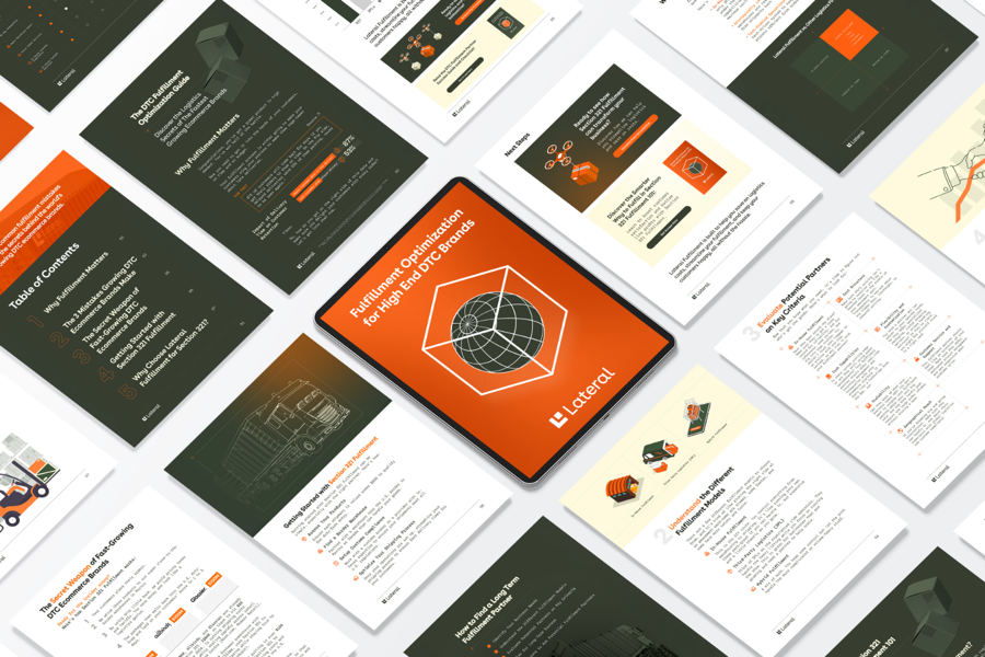
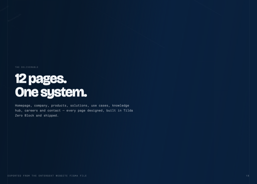
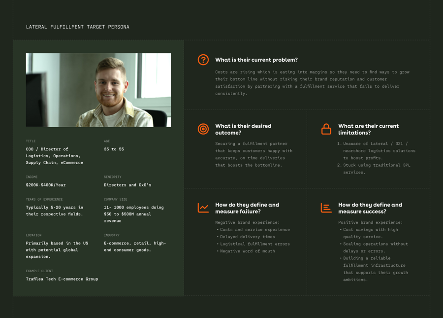
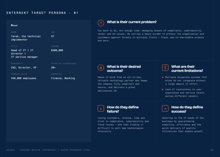
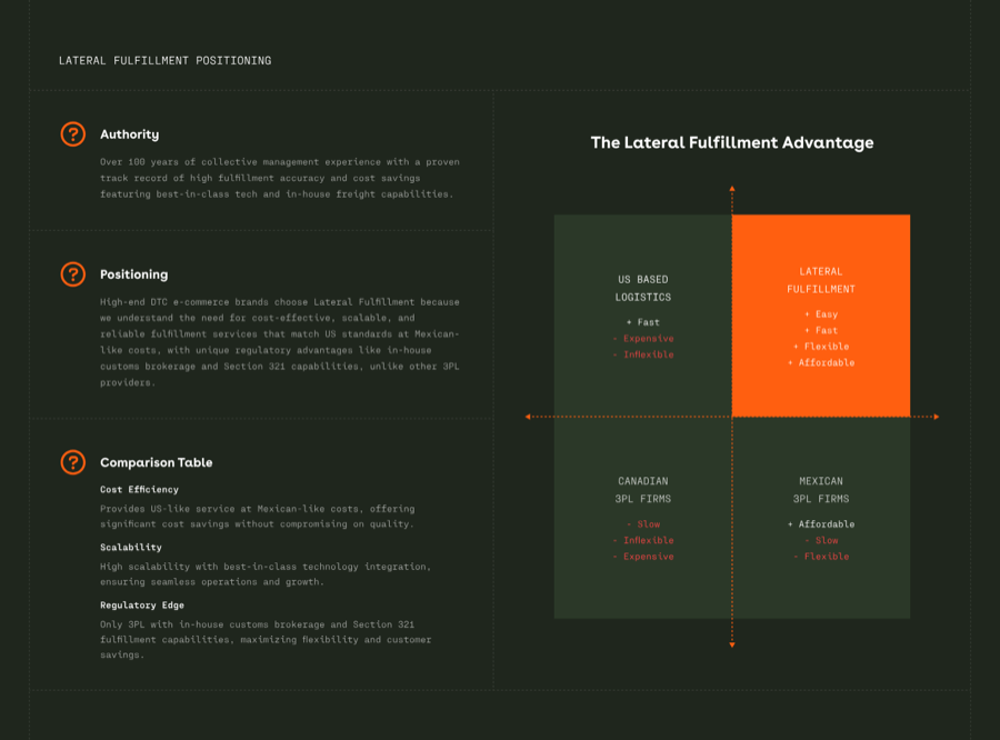
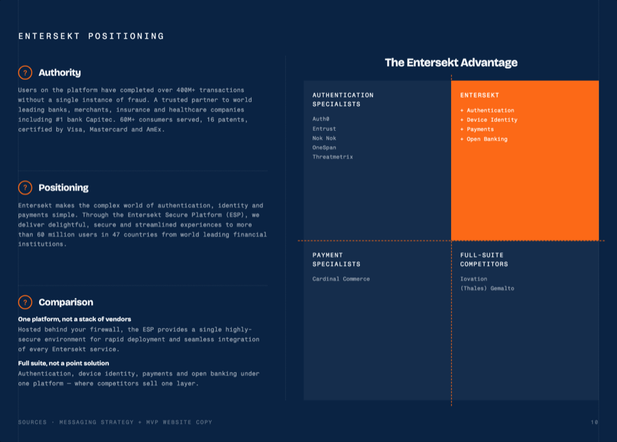
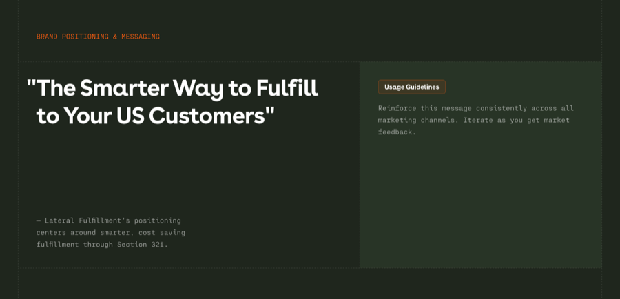
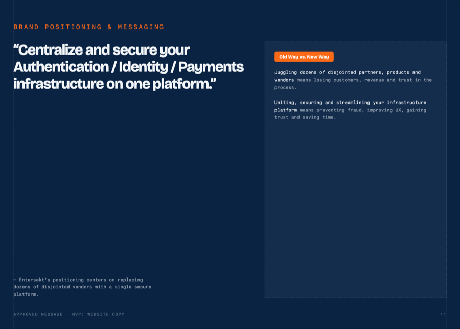

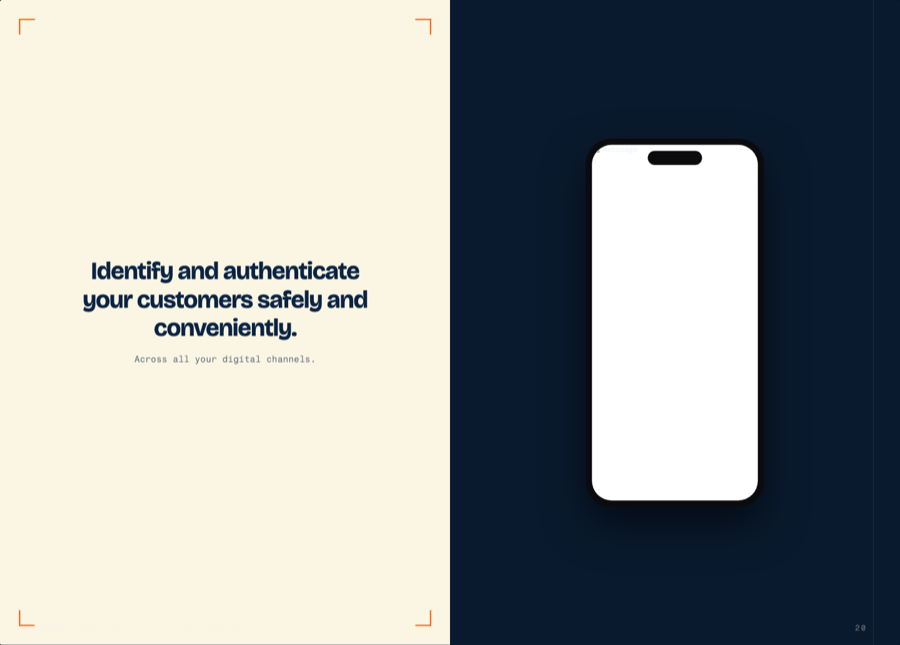
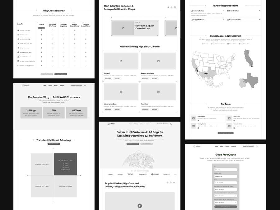
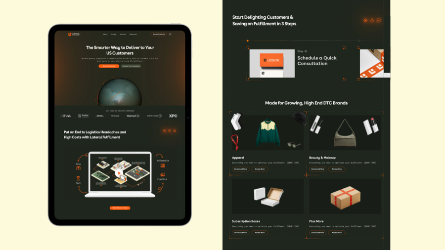
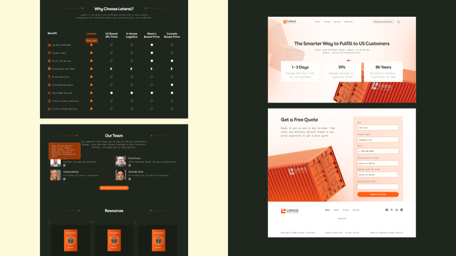
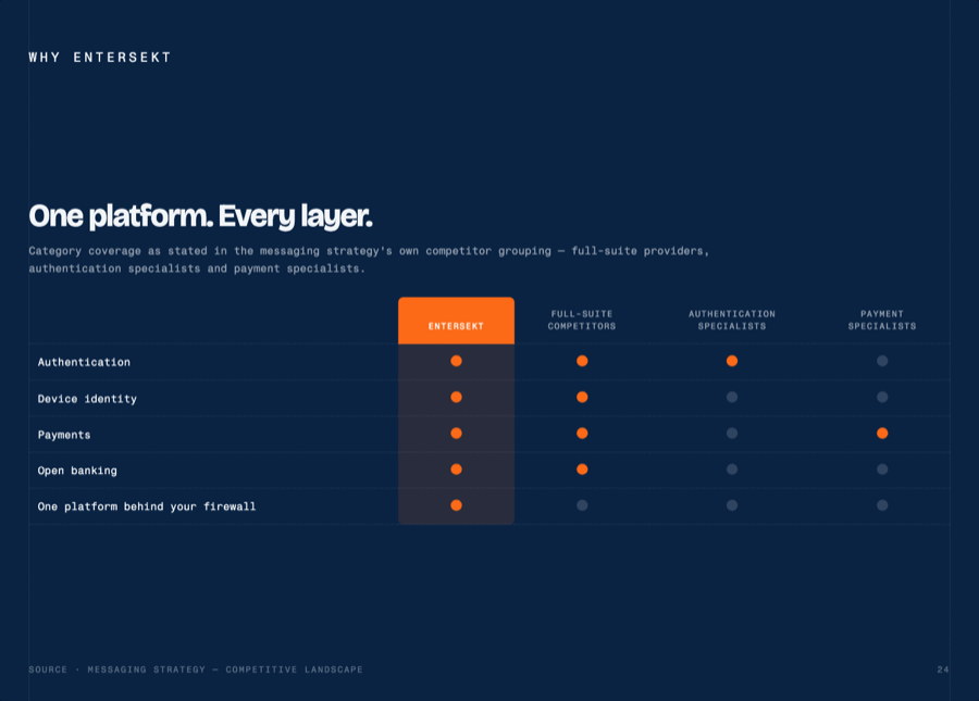
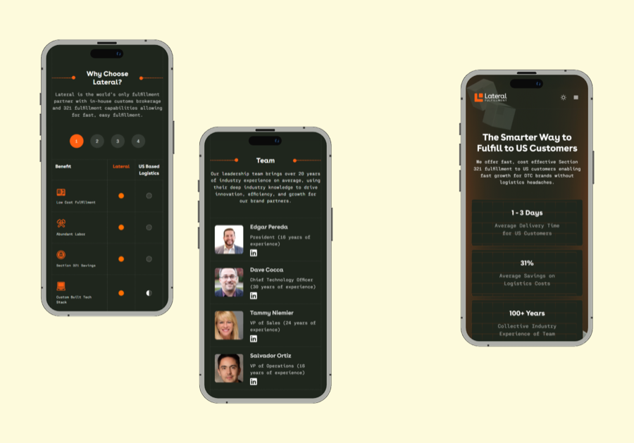
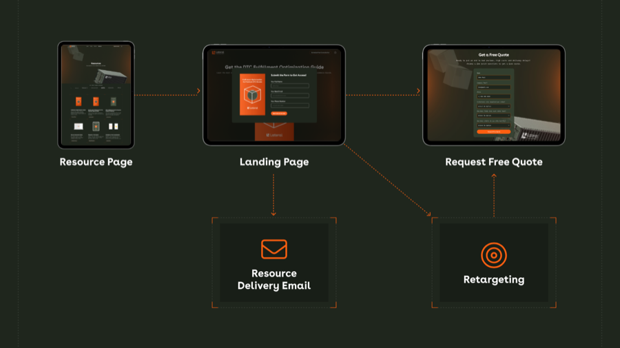
OPEN · (1) Typography is a brand token, not a component constant — the generated column still renders in Lateral's Bricolage/Fragment and must move to per-brand fonts, defaulting to Geist / Inter. (2) The engine is a parallel static-HTML system; GREEN rows duplicate real React components. (3) title-card — 13 of Lateral's 39 slides — is still unbuilt. (4) Studio output, so no slugs in lib/canonical/components-v18.ts.
components/ui/macbook-scroll.tsx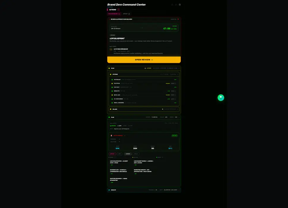
components/ui/container-scroll-animation.tsx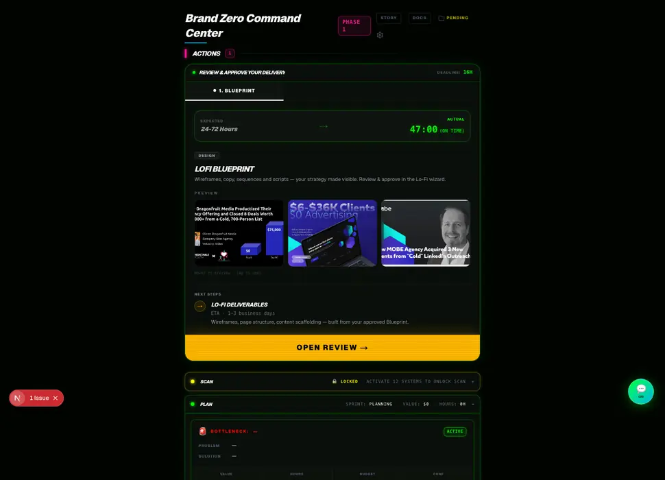
components/ui/terminal.tsxblock/chat-conversation.tsx



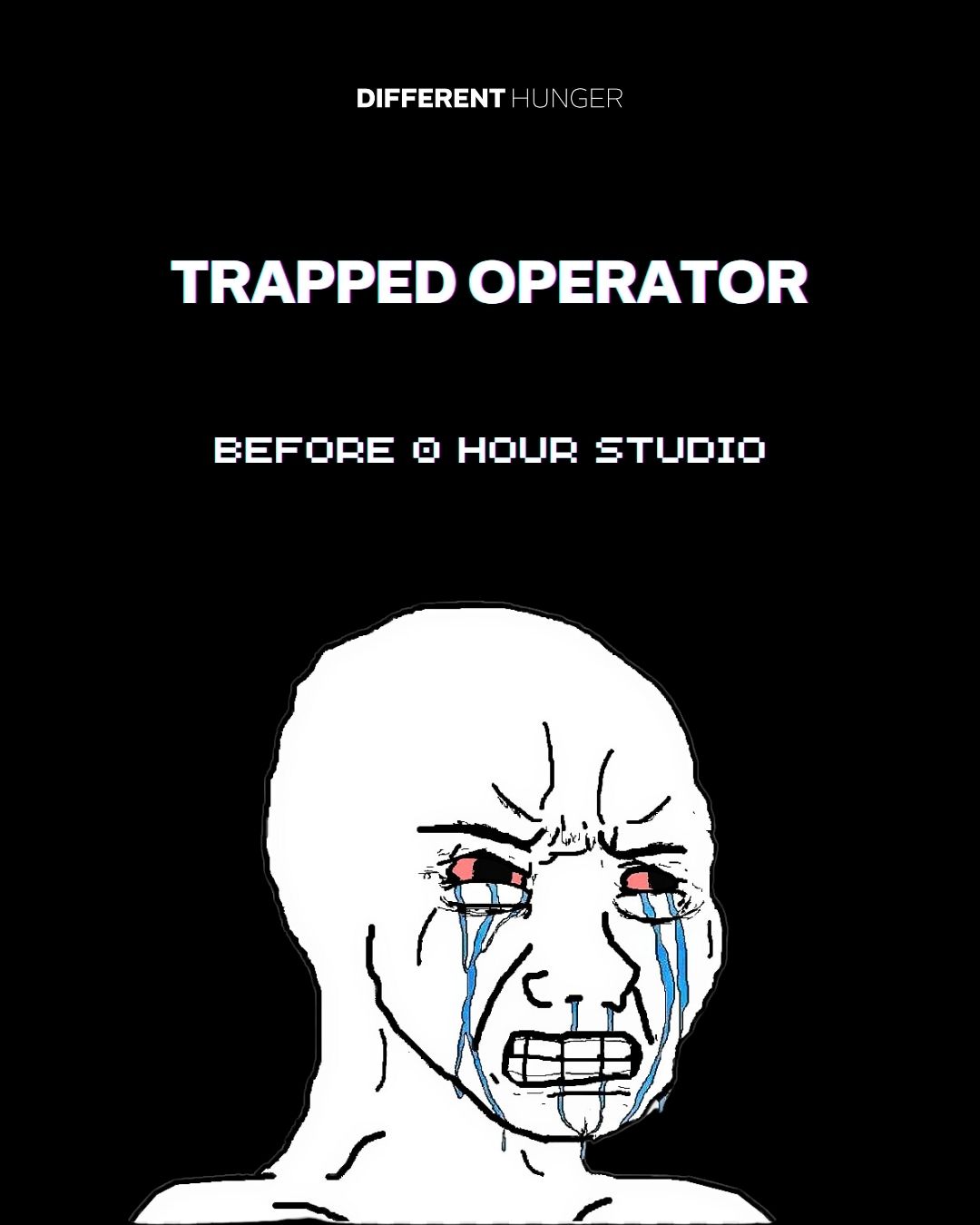
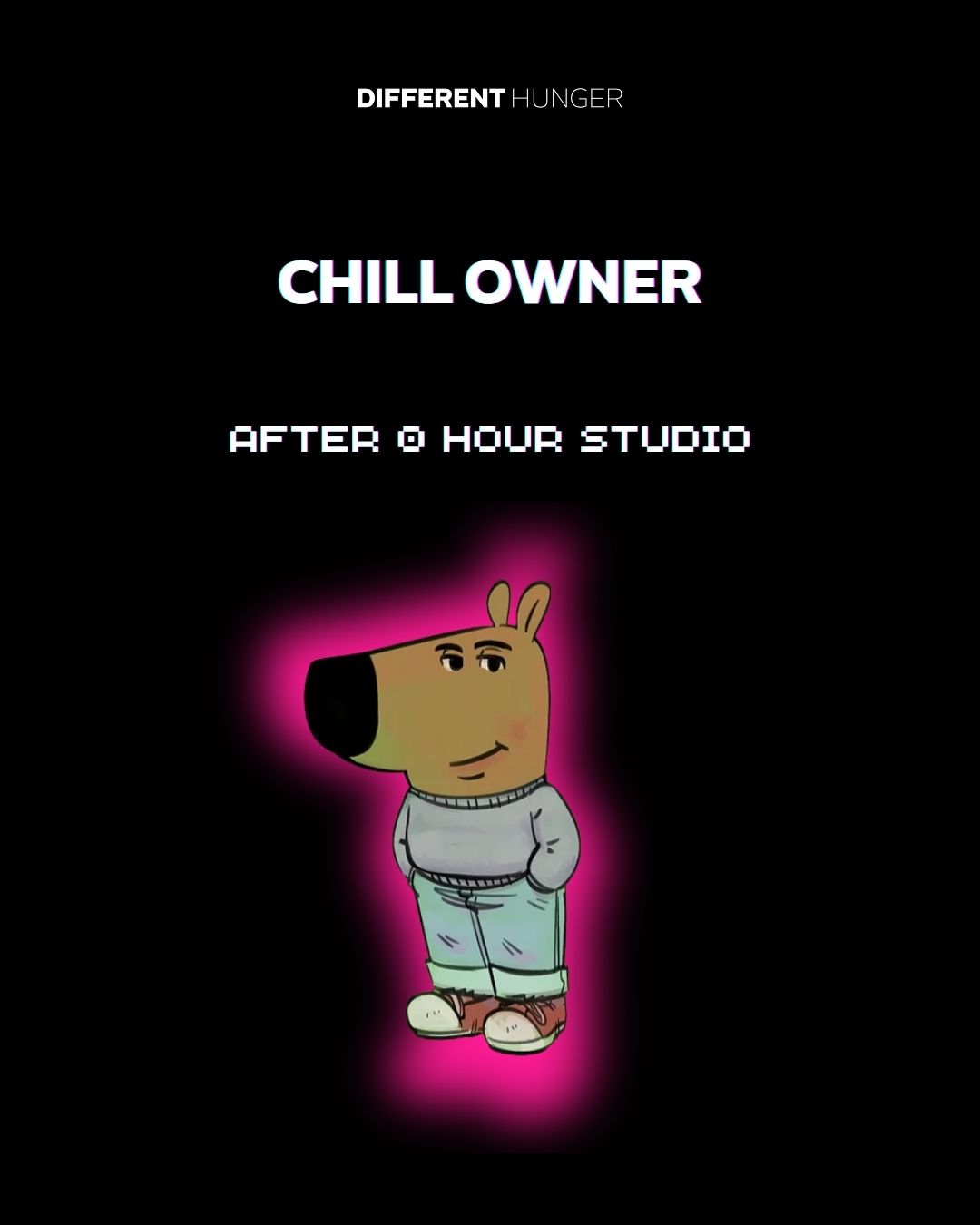
components/grid-background-demo.tsxblock/uptime-status-illustration.tsxcomponents/ui/images-badge.tsx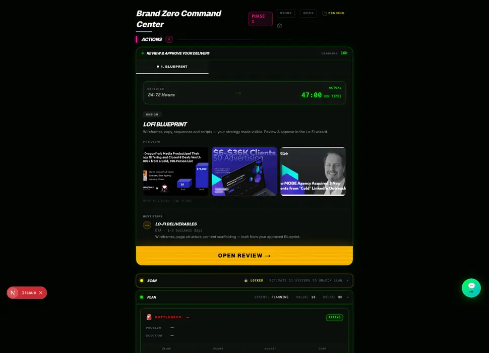
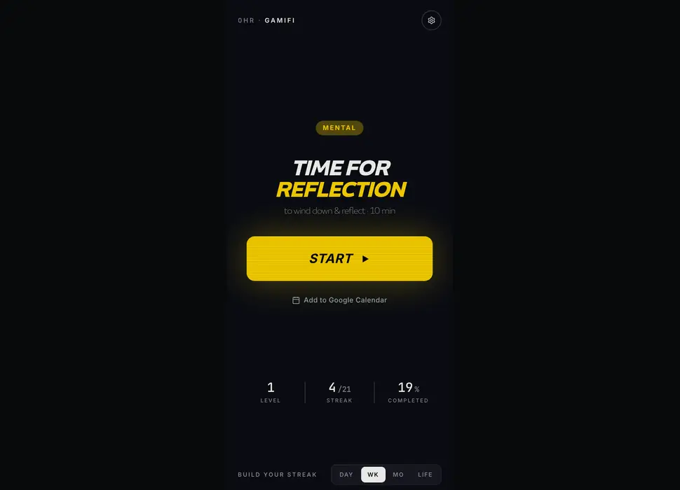
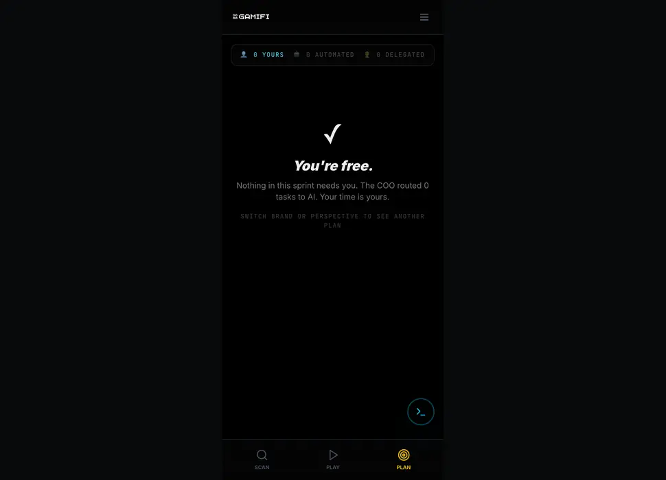
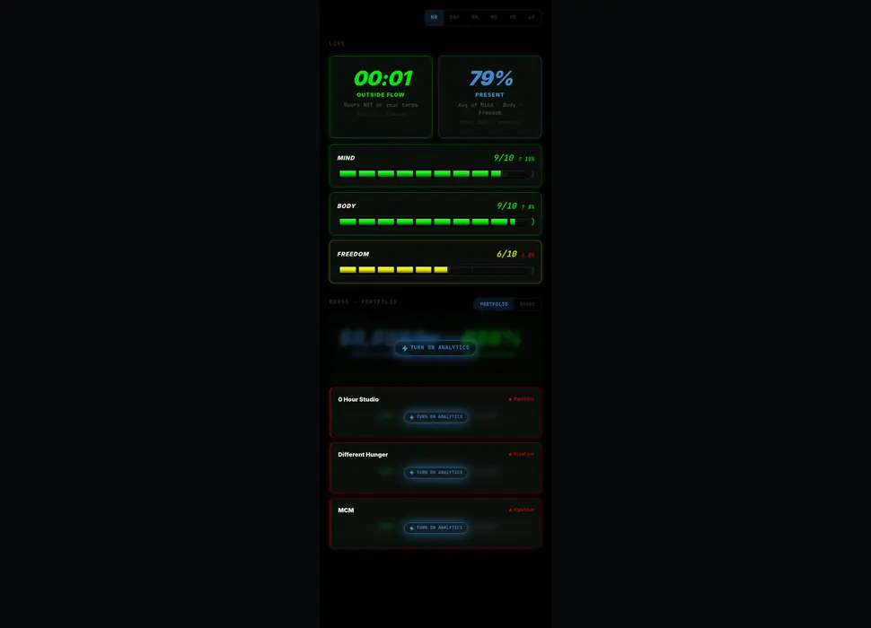
0HR's own press, as an endlessly scrolling logo row (PressMarquee). Mounts after the page is idle, loops seamlessly, and stands still for visitors who prefer reduced motion. Only on 0HR / Different Hunger pages, never on a client brand's page.
As Featured In
The central inbox for every brand (mk, 2026-10-03). Retro terminal family, same lineage as Terminal / CRT. Rule-of-three stat strip, channel chips, one live ledger of every text, call and message with a status pill, and a Needs Your Attention queue for the few items a person must handle. Sample data below; the live drawer (HQ header → inbox icon) feeds the same components real data.
The community globe from /results: every member with a location as a marker, drag to spin, the face wall underneath (hover names each person). Live data from /api/results. Off /results for now.
Powered by Different Hunger | Built by 0 Hour Studio
0HR Design System · refine here, reuse everywhere